Average Home Price Growth
Historic home prices for Toronto Real Estate
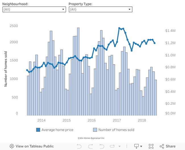
Last updated March 2018
Average home prices fell 17% to $1.2m in March 2018, compared to prices a year earlier (ahead of the housing reform). Historically low ‘Sales Volumes’ for early 2018, down 37% from the same time last year, means that seller's must either accept lower offers or delay putting their home up for saleThe biggest impact on prices was the fair housing plan introduced by the Ontario Government in April 2017. There were 16 big changes and some of these tactics included: a 15% tax on foreign buyers, rules that discourage speculative property investments, and expansion of rent controls. Many experts suggest the fair housing plan has also changed the psychology of the market. More recently, increases to mortgage rates near the end of 2017 have had further pressure on prices – with more rate increases expected in 2018.
*Analysis focusing only on detached and semi-detached homes in the City of Toronto.
How much has the Toronto market cooled down?
Sales-to-Listing Ratio
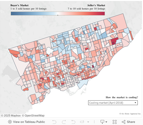
Last updated April 2018
A year ago, ahead of the housing reform, there was strong demand for Toronto real estate. See for yourself – swipe left to 2017 and Toronto gets painted red. And this isn’t happening because the Toronto FC won the MLS cup last year! The market is red hot. Fast forward a year later (April 2018) and you can see how the market has cooled. Many of the areas that were selling hand-over-fist a year ago have cooled down. This is giving buyer’s more bargaining power and more choice. Seller’s can take a haircut (vs. their often-lofty expectations) or wait (and hope) for the market to spring upwards in the next months.[2018] Cooling market: heat map for sales-to-listing ratio in the last 12 months trailing April 2018
[2017] Hot market: Heat map for sales-to-listing ratio in the 12-months trailing April 2017
A healthy market will have ratio of 40% to 60%. A high-level redness indicates a strong seller’s market because there few homes that are going unsold. At the opposite end of the spectrum, the more intensity of blueness tells us it’s a buyer’s market – meaning that most of homes are not being sold and eventually are taken off the market.
Stay tuned for our next analysis on affordability and the specific neighbourhoods in Toronto that are more vulnerable to a market downturn.